Show someone the Lamborghini logo, and chances are they’ll recognize it instantly: gold and black, with the iconic “Raging Bull” front and center. But believe it or not, the bull wasn’t always synonymous with Lamborghini.
Automobili Lamborghini as we know it today traces its roots back to the 1960s and the original Miura. But before Ferruccio decided to take on Ferrari with a sports car of his own, the company was best known for building tractors. The tractor division still exists as Lamborghini Trattori, and that history makes the evolution of Lamborghini’s iconic logo all the more interesting.
1952: Lamborghini’s Tractor Roots
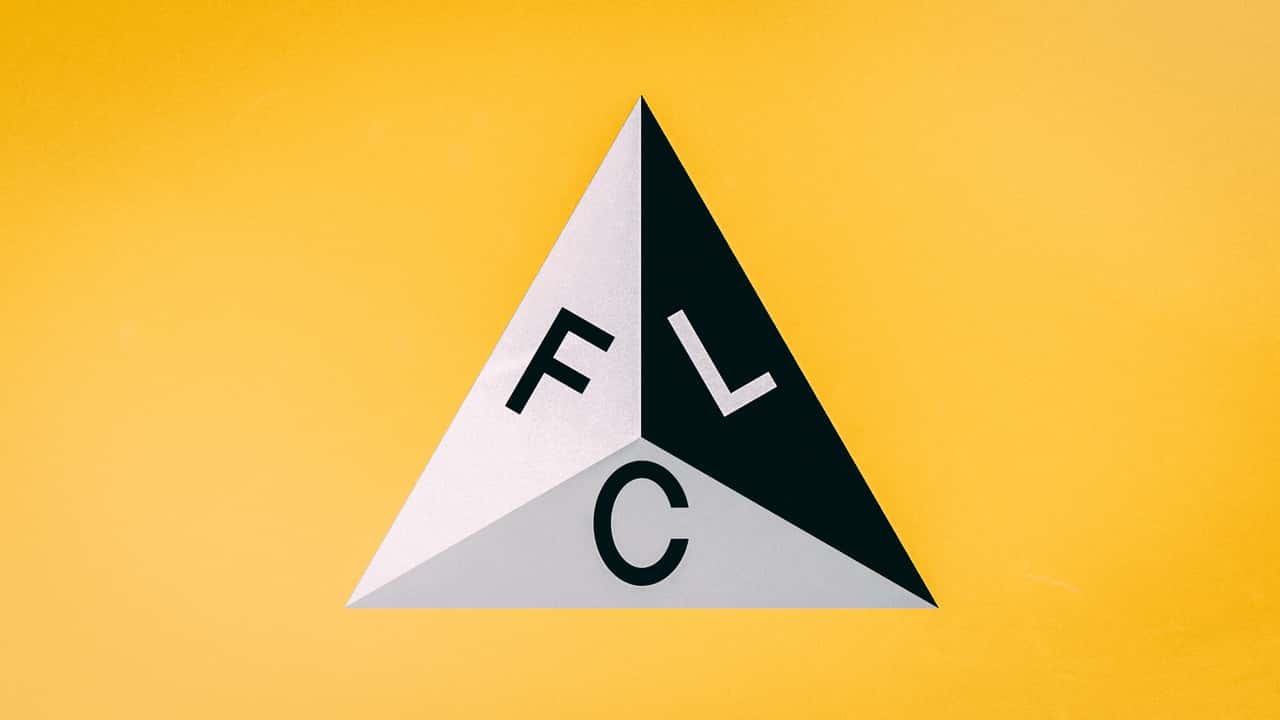
Photo by: Lamborghini
The first Lamborghini logo is probably completely unrecognizable. It was a simple triangular badge featuring the letters “F,” “L,” and “C” arranged in black, white, and grey segments. This was the first known logo for Lamborghini Trattori (the tractor company), with the three letters standing for “Ferruccio Lamborghini Cento.” Cento means 100 in Italian.
A few different versions of this logo appeared over the years, including one that shows the triangular badge with a bolder outline, a darker background, and a gray border around the “FLC” lettering. But it’s unclear exactly when these logos might have been used (if at all).
At any rate, the original “triangle” is a far cry from the Lamborghini logo we know today.
1963: Automobili Lamborghini Unleashes The Bull
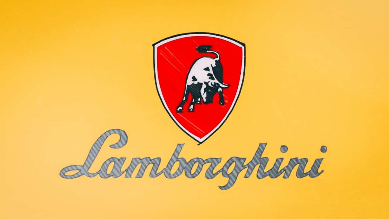
Photo by: Lamborghini
Automobili Lamborghini was officially founded on May 7, 1963, in Sant’Agata Bolognese, Italy. For the logo of his new automobile company, Ferruccio turned to local typographer Paolo Rambaldi. That’s where the iconic Raging Bull came into the picture.
Ferruccio was born under the zodiac sign Taurus, which explains the choice of the bull. Lamborghini also says the logo was inspired by an expression Ferruccio used to describe himself: “tamugno come un toro,” or “as tough as a bull.”
And just like that, one of the most recognizable logos in the automotive world was born.
1963 / 1964: The Logos That Never Were
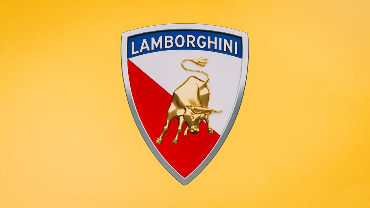
Photo by: Lamborghini
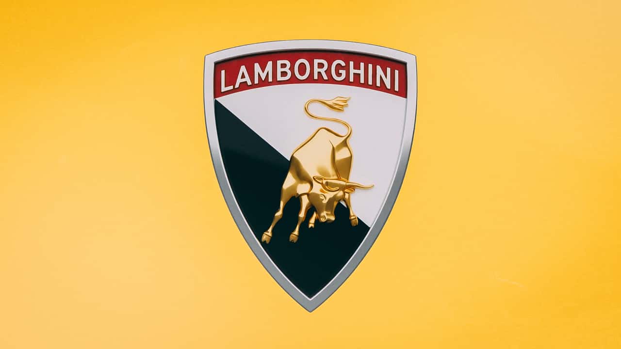
Photo by: Lamborghini
Photos by: Lamborghini
The first Lamborghini logo featured a white bull on a red background, with the Lamborghini script underneath. It’s already pretty recognizable to anyone familiar with the brand’s early history.
But Ferruccio apparently considered a few different versions of the badge. One featured a white-and-red background, a blue border around the script, and a gold bull. The other used a black-and-white background with a red border around the text.
Neither made it onto a production car. Lamborghini says both designs were “too complicated and had too many details” to work as production badges.
1972: The Iconic Black-And-Gold Logo Arrives
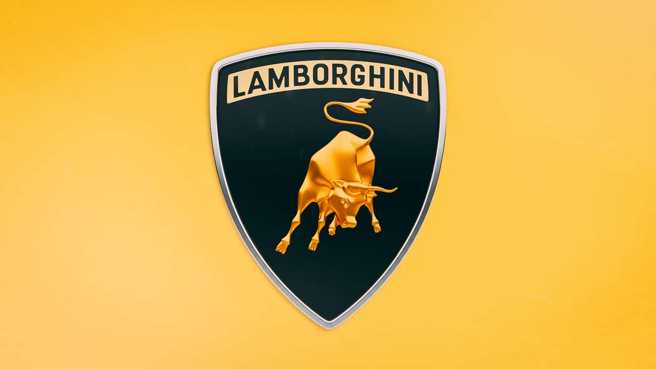
Photo by: Lamborghini
Even though Lamborghini toyed with the idea of a gold bull in the 1960s, it wasn’t until 1972 that the gold Raging Bull became official. The updated badge kept the basic shape but added a gold bull against a black background, with the Lamborghini script placed at the top of the emblem on a gold field.
This was the logo that would go on to define Lamborghini for the next few decades.
1974: Oversimplification Under New Ownership
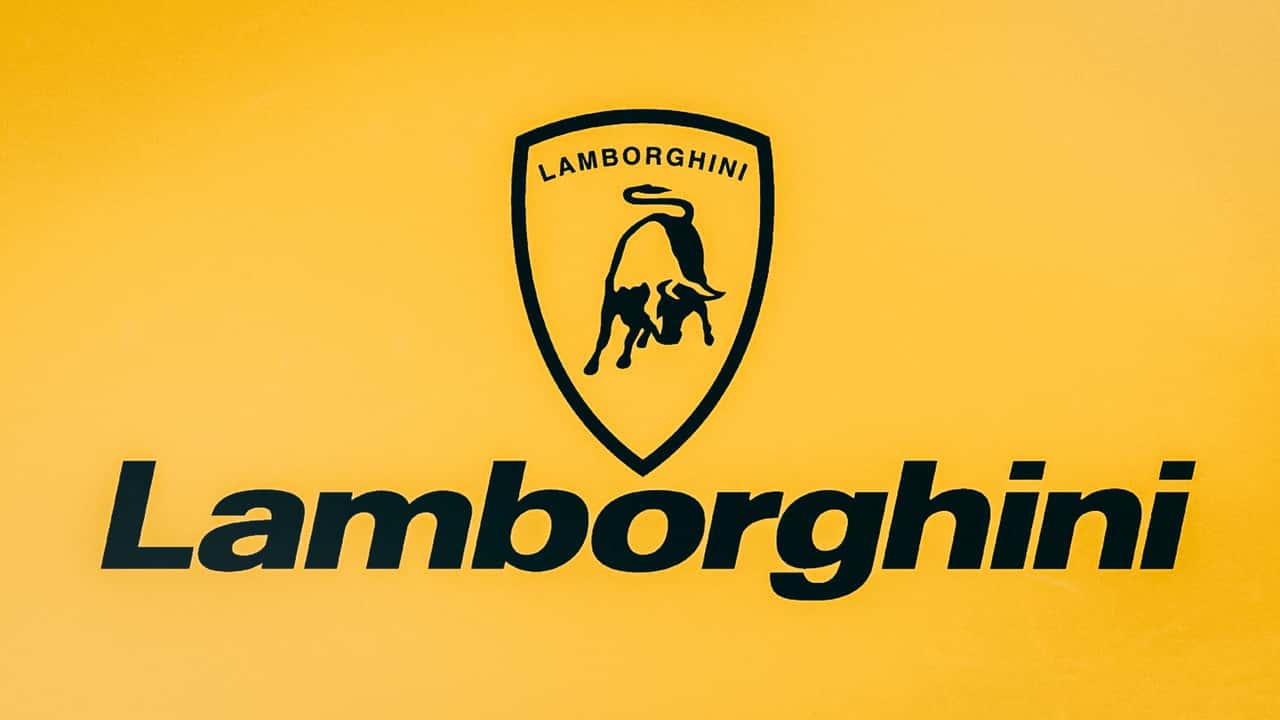
Photo by: Lamborghini
This is where the story gets a bit… messy. While the black-and-gold Raging Bull would remain on Lamborghini’s road cars until the 1990s, the company changed its corporate identity in 1974 to something considerably simpler. Aka: worse.
That same year, Ferruccio sold his remaining 49 percent stake in Lamborghini, severing his ties with the company for good. New owners Georges-Henri Rossetti and René Leimer tried to modernize the brand with a new Lamborghini wordmark and a monotone logo. Thankfully, neither design made its way onto Lamborghini’s road cars.
1990: New Flagship, New Hue
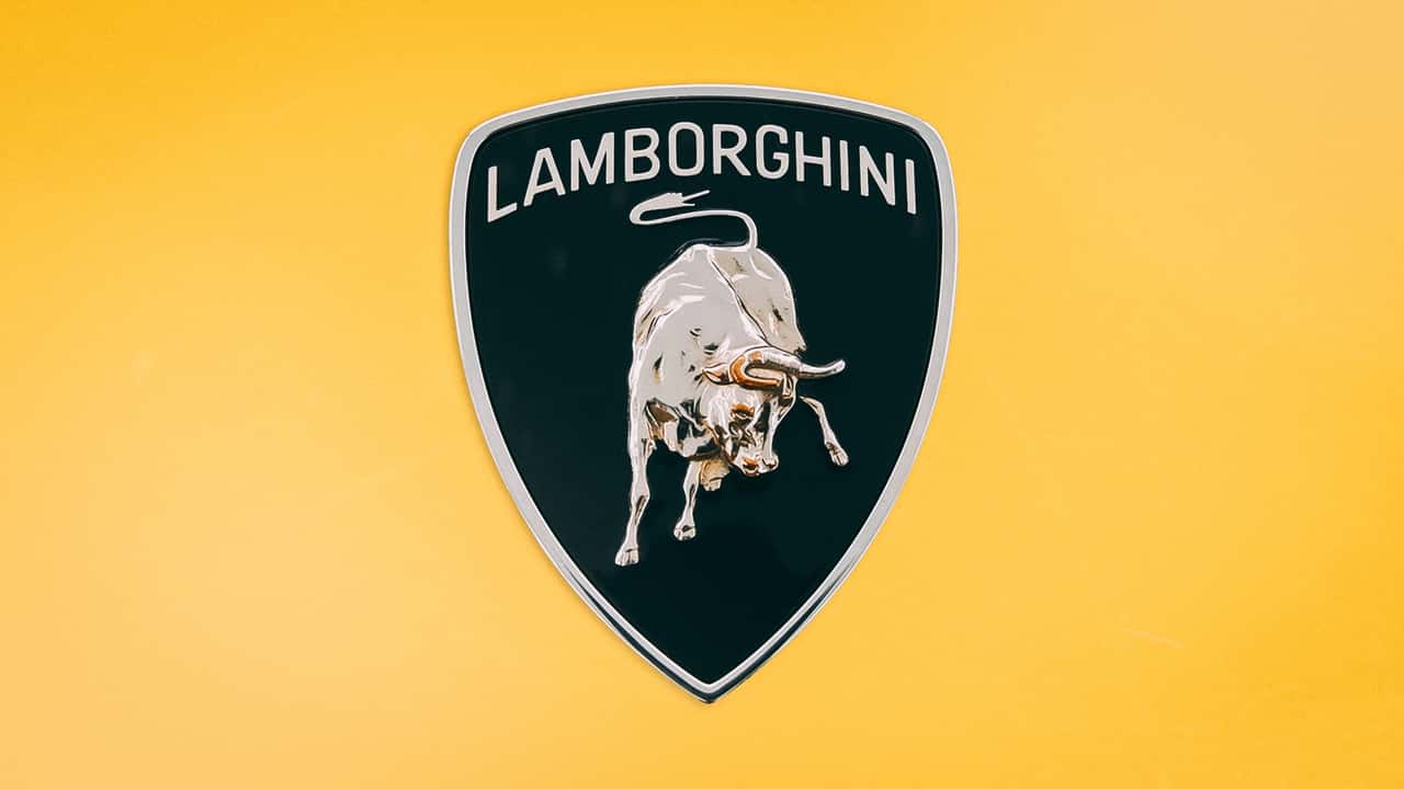
Photo by: Lamborghini
With the Countach on its way out, Lamborghini introduced its new V12 flagship, the Diablo, in 1990. To mark the occasion, the company also introduced a new badge. The latest emblem was bolder than its predecessor, with cleaner lettering at the top and a more detailed Raging Bull in the center. But maybe the biggest change was the color—or lack thereof.
Lamborghini ditched the gold that had been synonymous with the brand since the early 1970s and switched to a monotone silver badge instead. That design would stick around until the next major update in 1998.
1998: Gold Is Back, Baby
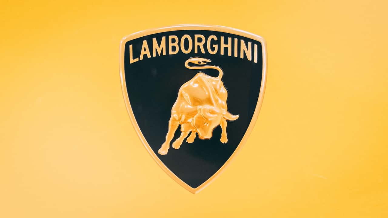
Photo by: Lamborghini
Lamborghini largely stuck with the silver badge throughout the Diablo era. But 1998 brought a major change for the company: Volkswagen Group acquired Automobili Lamborghini through its Audi division.
As part of the transition, Lamborghini revived its iconic black-and-gold logo and modernized it for a new era.
This was also the first Lamborghini logo fully designed by the company’s new in-house Centro Stile design division. The emblem received a subtly updated shape, while the “Lamborghini” wordmark was placed directly on the black background.
2024: A Fully Modern Bull
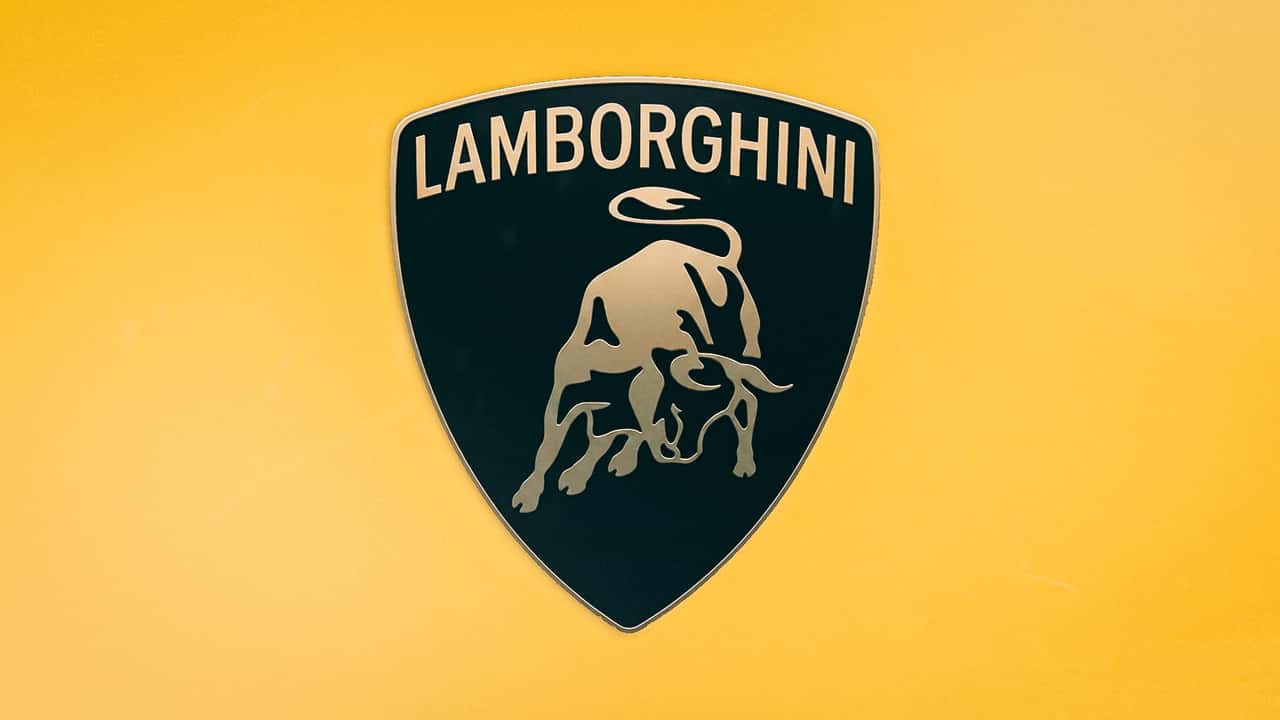
Photo by: Lamborghini
Lamborghini essentially kept the same black-and-gold Raging Bull throughout the late 1990s and 2000s, but the logo finally got another major update in 2024. The change came as automakers across the industry embraced flatter, simpler branding. Lamborghini followed the trend.
The company flattened and simplified the Raging Bull, introduced a subtler shade of gold, cleaned up the bull silhouette, and slightly revised the wordmark. Lamborghini describes the new design as “minimalist,” with “no raised elements and few details.” Fun.
The Lamborghini logo has evolved a lot since 1952, and yet the Raging Bull remains a status symbol of performance and luxury. Don’t expect that to change anytime soon.
History Of The Aston Martin Logo: How The Wings Have Evolved
History of the Bentley Logo: How the ‘Winged B’ Evolved